Tuesday, February 18, 2014

Capturing a thermal IR video with ffmpeg on Linux

When tethered to a computer with USB the Flir E4 [1] thermal camera can act as webcam. The frame rate is limited to 9fps due to ITAR restrictions [2], but this is sufficient for most applications. On Linux FFMPEG [3] can be used to capture a video with this command line:

ffmpeg -f v4l2 -r 9 -s 640x480 -i /dev/video0 thermal.avi

You can preview while shooting with the camera's LCD. But sometimes you want to see a preview on screen. That turns out to be tricky.

I found a useful solution on this thread [4]:

1. Create a fifo file:
mkfifo /tmp/livevideo.fifo

2. Run mplayer on the fifo:
mplayer  -cache 512 -really-quiet /tmp/livevideo.fifo

3. Run ffmpeg to capture to file and also relay to the fifo:
ffmpeg -f v4l2 -r 9 -s 640x480 -i /dev/video0 thermal.avi -map 0 -f avi -vcodec rawvideo -y /tmp/livevideo.fifo

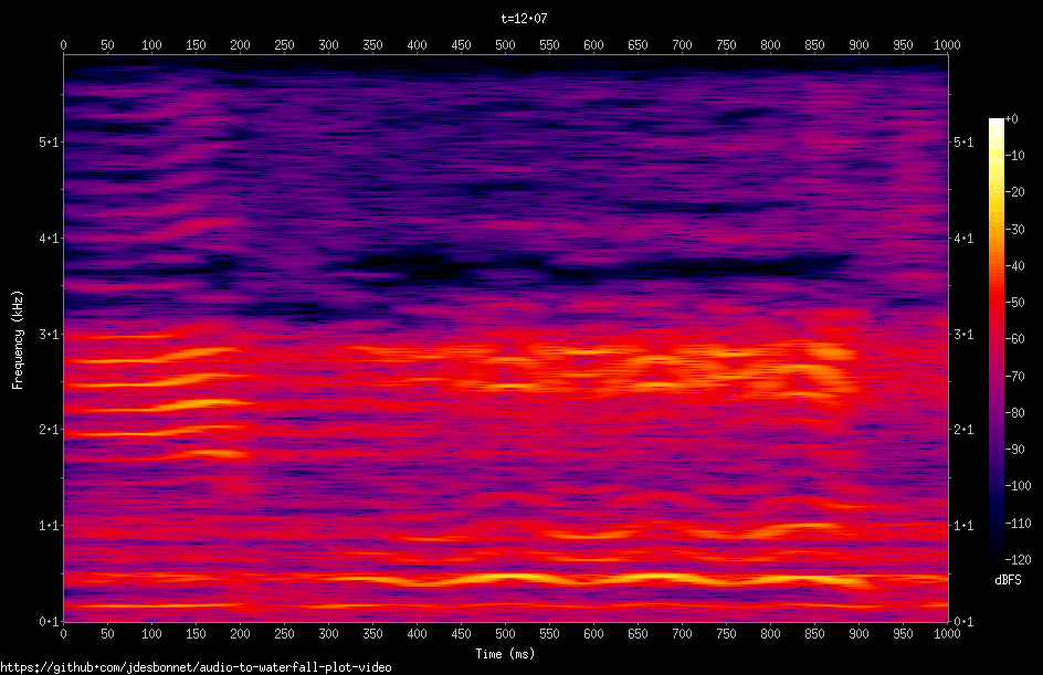
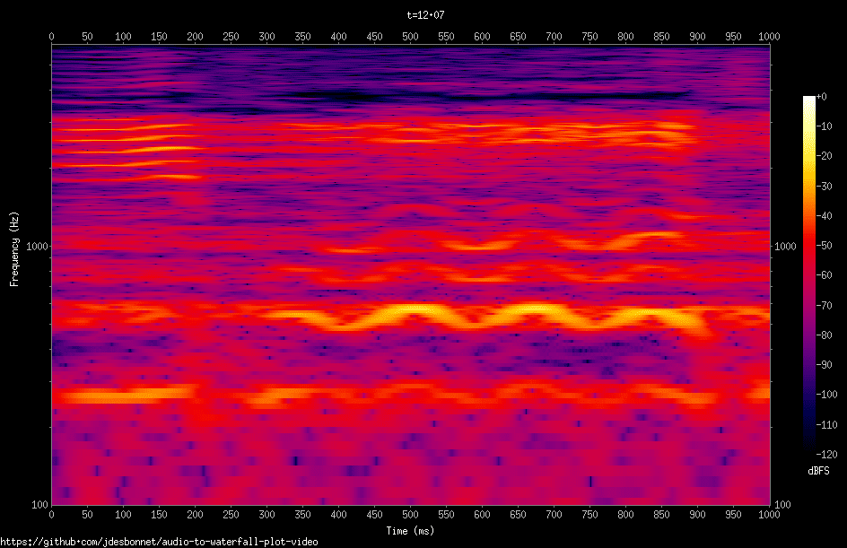
Here is a sample video captured with ffmpeg:


Footnotes:

[1] also the Flir E6, E8, the Exx range and most (all?) recent models as far as I know

[2] http://en.wikipedia.org/wiki/International_Traffic_in_Arms_Regulations

[3] http://www.ffmpeg.org/

[4] http://nerdfever.com/?p=2661

Monday, February 17, 2014

Sox spectrogram log frequency axis and upper/lower frequency limits

Linear spectrogram
As a result of some of the work I did last week on rendering MP3 files to scrolling spectrum waterfall plots, I noticed that most of the interesting detail was in frequencies under 1kHz.  One obvious way to see the detail at lower frequencies, yet still keep the higher frequencies is to plot on a log frequency scale.

Unfortunately this is currently not supported in SoX, so I modified the spectrogram module to add this feature. This I noticed that plotting charts from 1Hz to the nyquist frequency meant that a lot of screen space was wasted in the lower 1 - 50Hz range which is not the most interesting for most audio files. So I also added a switch to set the lower and upper frequencies of the chart (this actually took considerably more work than the plotting to the log scale!).

Log axis spectrogram. Lower frequency details are far more visible.
The modified spectrogram.c file is available here [1]. Visit the SoX site [2], download the source code, replace src/spectrogram.c with this file and compile. This has been tested with the latest code as of 14 Feb 2014.

Summary of changes:
  • Implement -L which plots the spectrogram on a log10 frequency axis. By default from 1Hz to nyquist frequency.
  • Implement -R <low_freq>:<high_freq> : restrict spectrogram frequencies. I also updated the linear scale code to honor this switch.


Example:

sox mymusic.mp3 -n spectrogram -L -R 50:8k

Known problems and observations:
  • At lower frequencies (1 - 100Hz) each spectrum bin in q->dBfs[] array occupies several pixel rows: so it looks blocky. A lesser problem: at the top some frequency bins will be ignored because there will be more than one bin for each pixel row. I could fix the blockyness by getting a more detailed spectrum.
  • If lower and upper frequencies are in the same decade then there are no y axis tick labels. Hopefully will have a fix for that soon.
  • When compiling I'm getting this warning when using log10f() and powf() : "warning: passing argument 1 of 'log10f' as 'float' rather than 'double' due to prototype". According to the man pages for those function they should accept float args! I see some discussion on this relating to compiler switches: but I don't want to go changing anything there.
  • I created two new functions to parse the -R frequency range switch to cut down on code duplication.
    parse_range (const char *s, int *a, int *b)
    parse_num_with_suffix (const char *s, int *a)
    I'm not familiar with the sox code base, so I'm not sure if similar functions already exist (I couldn't find any). I'm also concerned I'm making a temporary change to a string in parse_range when the type is const char *.  I need to brush up on my C :)


Footnotes:

[1] https://github.com/jdesbonnet/joe-desbonnet-blog/tree/master/projects/sox-log-spectrogram

[2] http://sox.sourceforge.net/


Saturday, February 15, 2014

Boosting audio volume in a video file

For some reason I'm finding that some video files played directly on my new Samsung TV (by mounting a USB drive) have a low volume and boosting the TV's volume beyond 40 (of presumably 100) yields no additional gain.

This ffmpeg command can be used to boost the volume in the file:

ffmpeg -i myvideo.mkv -vcodec copy -af "volume=12dB" myvideo-boosted.mkv

You can vary the boost by chaning the volume gain parameter. I found 12dB was about right. Negative values are allowed also.

Wednesday, February 12, 2014

Convert MP3 to a scrolling spectrum waterfall plot video

There are many utilities that display a scrolling spectrum waterfall plot [1] from a signal, but I was unable to find any open source utility that converted an audio file into a video file with a scrolling waterfall plot + the audio.

The SoX [2] sound utility can generate a static spectrum waterfall plot image from an audio file (or part of it), but it can't make a video. So I wrote a script to do this.

It's a very brute force approach. It requires lots of CPU time and lots of temporary disk space. The script depends on SoX, GNU Parallel, mencoder (or ffmpeg). GNU Parallel is optional, but will result in significant speed up on a multi-core system.

To use, create an empty directory on a volume with plenty of disk space and run with the audio file as a parameter.  Eg:

./make-spectrogram-video.sh -t "My Music File" mymusic.mp3

The output will be written to output.avi and output.mp4. Other options include setting frame rate, the speed of the scrolling, audio credit text etc. To get full help do this:

./make-spectrogram-video.sh -h

The script is available on GitHub here [2]. Here is a sample output video of Bach's Toccata and Fugue in D Minor [3] :


Updates:

17 Feb 2014: I noticed that all the interesting details in music is squashed down at the very bottom of the spectrogram. So I updated the spectrogram module in SoX to have the option of plotting on a log axis. This isn't in the offical sox distribution. See this blog post for more details [4].

Footnotes:

[1] http://en.wikipedia.org/wiki/Waterfall_plot

[2] https://github.com/jdesbonnet/audio-to-waterfall-plot-video

[3] Music MP3 file from https://archive.org/details/ToccataAndFugueInDMinor. YouTube video at http://www.youtube.com/watch?v=utp95bprqeg

[4] http://jdesbonnet.blogspot.ie/2014/02/sox-spectrogram-log-frequency-axis-and.html

Tuesday, February 11, 2014

Simple is better when it comes to microwave oven UI

About a year ago the magnetron (the magic yolk that generates microwave radiation) on my old Sharp microwave oven failed. This is not economically repairable failure mode, so I went shopping for a new oven. I resisted the temptation to get one with lots of lights, buttons and bluetooth. Instead I opted for a €49 oven with a simple mechanical user interface.

After a year of use I have to say it's the best oven user interface I've ever used. It's faster to set than the keypad of the old oven. The only feature I miss from the old oven is a kitchen timer. And it's a missed opportunity here: all they needed to do was add a zero power option on the power setting knob!

Monday, February 3, 2014

A fine stretch in the evenings

This is small web app (click to try) I wrote, inspired by that phrase often said at this time of the year at this latitude: "a fine stretch in the evenings". It is also inspired by a low-latitude friend who thought our long summer days a bit freaky :-)  [1]


It's a well known phenomena that day/night lengths vary throughout the year with latitude. From no variation at the equator to the extreme 24 hour days and nights near the poles. This app helps you visualize this variation. Enter your latitude/longitude or choose your location on a map. You'll get a visualization of the length of days/nights throughout the year at that location. The system will estimate the appropriate timezone for each location and adjust for 'wall clock' time accordingly.

On the chart black is night (obviously), yellow is day and the blue band is twilight. If there is daylight saving in the timezone then you will see a discontinuity in the sun rise/set curve during the transitions.

You can have one or two locations (although a HD monitor will be required to fit both charts side by side).

Some interesting well-known observations:

1. Here in Ireland the days get depressingly short during the winter and we all get a bit cranky, sick, moldy and drink too much. [2]

2. At the equator, day/night is pretty much same all year around. They all have a happy disposition and they don't drink at all! [3]

3. Up near the arctic circle there comes a point in the year where the sun doesn't rise at all. Oddly up there there they don't seem to get nearly as cranky, sick or moldy as we do in Ireland, but they still drink too much.

Some lesser known observations:

1. The length of twilight varies with latitude. In fact you can estimate latitude using just that [4] 

2. The shortest day of the year, the day of latest sun rise and the day of earliest sun set are not the same! (ie the sun rise and set curves are not exact mirrors of each other)

This app uses HTML5 has been tested with the latest Chrome and Firefox browsers. It will probably will cause Internet Explorer to explode.
Enjoy!!
[3] There are exceptions!

[4]  http://www.birdtracker.co.uk/