Tuesday, June 10, 2014

Weight charts from wwdiary, part 2

In part 1 [1] I described a way of generating nice weight charts from the data stored in the wwdiary [2] weight loss app.

I record a daily weight measurement, usually first thing each morning. As one would expect this can vary a lot from day to day for all sorts of reasons. To get a better handle of the trends a smoothing filter can be applied to the data. There are many methods of doing this, eg Moving Averages. The one I've opted to use here is the Leaky Integrator [3] due to its simplicity.

The unsmoothed chart looks like this.


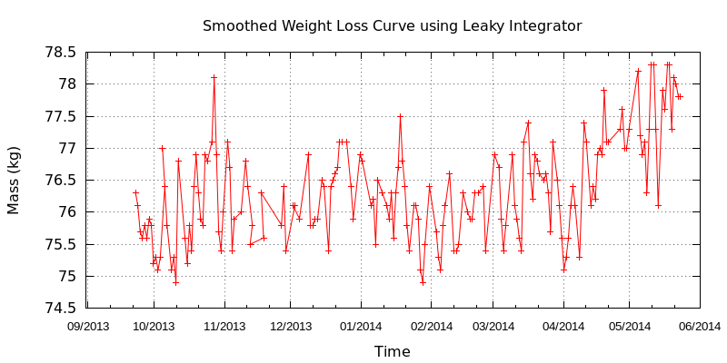
The following is a GnuPlot chart that applies the Leaky Integrator smoothing to the data (assumed to be in file weight.dat, see part 1 on how to extract this from the wwdiary database):

# GnuPlot script to plot smoothed weight from datafile in format
# uuuuuuuuuu ww.w
# Where uuuuuuuuuu is date in unix epoch time
# and ww.w is weight (in kg here, but trivial to change to other units).
# One record per line. 
# 
# Smoothing is acomplished with the Leaky Integrator
# http://en.wikipedia.org/wiki/Leaky_integrator
# 
# Joe Desbonnet, jdesbonnet@gmail.com, June 2014.
#
set xdata time
set timefmt "%s"
set format x "%m/%Y"
set xtics font "Arial, 10" 
set title "Smoothed Weight Loss Curve using Leaky Integrator λ=0.8"
set xlabel "Time"
set ylabel "Mass (kg)"
set grid
set key off
set term pngcairo size 800,400
set output "weight.png"
# Lambda (0 ≤ λ < 1.0) determines smoothing. Higher values for more smoothing.
lambda=0.8
ym1=0
leaky_integrator(x) = (ym1 = ym1==0 ? x : (1-lambda)*x + lambda*ym1)
plot 'weight.dat' using 1:(leaky_integrator($2)) with linespoints, \
     'weight.dat' using 1:2 lt 3


After applying the smoothing filter (and plotting the original points in blue for reference):


You can adjust the 'strength' of the smoothing filter by changing the value of lambda. Lambda can vary from 0 to 1. The closer to 1 the higher the smoothing effect.

References:

[1] http://jdesbonnet.blogspot.ie/2014/06/weight-charts-from-wwdiary-part-1.html
[2] https://play.google.com/store/apps/details?id=com.canofsleep.wwdiary
[3] http://en.wikipedia.org/wiki/Leaky_integrator

Monday, June 9, 2014

Weight charts from wwdiary, part 1

I've been using an excellent Android app called wwdiary [1] for over two years to lose (and then manage) my weight. The app allows you to record your daily weight, but unfortunately has no inbuilt charting [2]. So I wrote a script to extract the data and make my own charts.

Here is my chart:

Here's how to make your own:

This recipe requires a few command line tools. I'm using Linux, but to the best of my knowledge all these tools are available for Windows and Mac and should work exactly the same way described below. You'll need SQLite (there are several implementations), and GnuPlot.

wwdiary uses the SQLite database engine for storage, and you can grab a copy by going into the app settings and saving a copy of the database to SD Card. Copy this file to your computer using whatever file transfer tools you have to hand (I often just email it to myself using the gmail app file-attach option). Let's call this file wwdiary.database.

First you need to extract the weight from the SQLite database in a format that's easy for GnuPlot to parse.  Create a SQLite script file. Let's call it extract_weight.sqlite:

.separator "\t"
select date/1000,weight*0.453592 from weightlog;
.quit

Note the "/1000" is to convert the unix epoch timestamp in milliseconds to seconds and the "*0.453592" is to convert imperial pounds used internally in the app [3] to kg. Run the script and send the output to weight.dat:

sqlite3 wwdiary.database < extract_weight.sqlite > weight.dat


The contents of weight.dat should look something like this:

1379890800 76.2999384291992
1379977200 76.0999346446533
1380063600 75.6999409180908
1380150000 75.5999355651855
...

Create the plot script, call it say weight.gp:

# GnuPlot script to plot weight in format
# uuuuuuuuuu ww.w
# Where uuuuuuuuuu is the unix epoch time in seconds
# and ww.ww is weight (I use kg, but use what you like).
# 
# Joe Desbonnet, jdesbonnet@gmail.com, June 2014.
#
set xdata time
set timefmt "%s"
set format x "%m/%Y"
set xtics font "Arial, 10" 
set title "Weight Loss Curve"
set xlabel "Time"
set ylabel "Mass (kg)"
set grid
set key off
set term pngcairo size 800,400
set output "weight.png"
plot 'weight.dat' using 1:2 with linespoints


And now run it:

gnuplot weight.gp

All going well, you should find a PNG image file called weight.png in the same folder with your weight chart.

In part 2 I'll show you how to apply a smoothing filter to the chart.

References

[1] https://play.google.com/store/apps/details?id=com.canofsleep.wwdiary
[2] There is a subscription service available where a chart can be viewed on an online dashboard.
[3] Oh please if you're designing software use SI (metric) units under the hood. Convert to antiquated Olde Worlde/American units at the user interface if you must. Even the Apollo moon avionics software from 1960s USA calculated in SI, converting to feet, furlongs, hundred-weight etc only at the last second at the user interface. (See http://dodlithr.blogspot.ie/2011/10/apollo-guidance-computer-agc-software.html)