First this is what demand looks like throughout the day. There are differences between summer and winter demand. Being a country where air chilling is rarely needed, a significant proportion of power is consumed by heating, but very little by cooling. So as expected average use during summer is less than winter. Night use is way lower than day use (no surprise there). In winter however, between 17:00 and 19:00 there is peak. This is presumably due to people coming home from work and switching on heating. This peak is a problem as it often stretches the Irish grid to its limits during the winter.
The following chart is a typical week. There is a clear difference between weekday and weekend use levels.
As mentioned earlier summer demand is lower than winter. Right in the middle of winter is the Christmas and New Year holidays which disrupt the usual patterns.
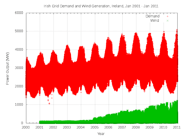
Over 10 years one can see a steady increase in electricity demand up to the recession in 2008. Wind generation really started to take off in 2005.
Here is the same 10 years of data displayed in oscilloscope style (one week per frame).
I believe there was a time where individual events were clearly visible in the demand charts. For example in the 1960s the RTÉ (the national broadcaster) could estimate the 'Late Late Show' viewing figures from spikes during ad breaks (tea, kettles...) [can't find any refs for this]. Nowadays there is so much power being consumed that it's very rare to see any individual event in the data. I did spot one exception which I assume had something to do with the events in the US on 11 Sep 2001. But how exactly that translated into a significant spike at about 12:00 the next day, I don't know.
The data is provided by EirGrid (the state-owned electric power transmission operator in the Republic of Ireland). The system demand definition is stated as “production required to meet national electricity consumption, including system losses, but net of generators' requirements. It includes power imported via the interconnector and an estimate of the power produced by wind generators, but excludes some non-centrally monitored generation (i.e. small scale CHP).”


1 comment:
Joe,
On your daily chart, could you also plot wind energy on the same Y-axis scale?
And do it for different WINDY days in winter and summer to see how close wind output comes to the demand.
My email is wilpost@aol.com
Post a Comment